
Since you’re probably reading this article in-between checking feeds, you already know that social media is now very present in your day-to-day activities. It can certainly be overwhelming. LinkedIn has chosen to incorporate social features; perhaps,we suspect, in the spirit of having users return more frequently and remain in their network for longer lengths of time. We feel that important value networks, such as LinkedIn, should strive to stay true to their purpose, and not seek to becomeanother newsfeed.
What is LinkedIn for?
The purpose of this professional network is to connect users who are looking for a job with users who need to hire somebody and we believe that’s the way it should work. As such, all of its features should work to support that purpose, and any new feature to be adopted should be measured against it. In this design exercise, we listed LinkedIn’s current features, made a short informal survey with LinkedIn users around the office, and decided to scrap the features we felt did not support its main purpose. On our survey, we asked users a) If they used LinkedIn to post/read links and b) If they used LinkedIn Groups. The consensus was negative on both cases.
Sketching
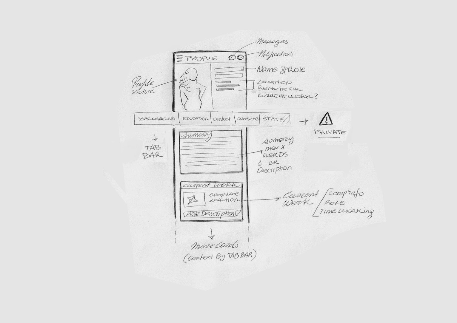
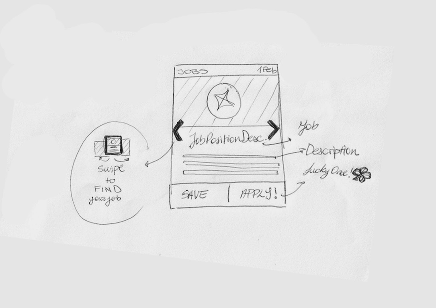
We then made screenshots of LinkedIn’s mobile app, rethought how some of the features should work and sketched how we thought they should look. We think better on paper:
We decided to adopt a card-based approach. This is how the profile would look without any social feeds and a reorganized navigation. Stats are private to the user.
The abbreviated Job card, including only the essential information.
We also rethought how the Jobs You May Be Interested In section could work if it adopted a Tinder-like approach.
Inspiration and User Flows
As we continued to work on our redesign, we took a look at how other designers had approached the same problem. We also looked at how other companies that share LinkedIn’s purpose (O-desk, AngelList), albeit for a more reduced user base; handle specific features. At this point, our project was starting to grow out of proportion, so we decided to limit our redesign exercise to two main flows:
User is looking for a candidate to fill a position.
User is looking for a new job.
Stay tuned for our next post, where we’ll explain how we redesigned flow a.
This post is part of a series where the XmartLabs Design Team tackles quick design challenges and lets you in on their process. Contact us at [email protected] if you would like to offer your users a better digital experience.
Next entry: Linkedin for Work, pt. 2: Finding candidates.

