
Have you ever found yourself closing pop-ups faster than you can say "annoying"? Turns out, you're not alone. With the idea of analyzing this phenomenon, we decided to dig into this whole pop-up situation: we've read various studies, looked at user tests and statistics, and guess what we discovered? Pop-ups are widely disliked in the field of user experience (UX).
An initial research from 2004 by John Boyd from Yahoo! and Christian Rohrer from eBay was considered for this analysis. It was a large body of tests on how users perceive online advertising supported by a survey based on 605 respondents.
Later, in 2017, Nielsen Norman Group —a renowned research and consulting firm that provides reliable guidance on the UX industry— conducted another survey with 452 respondents around the same issue. Many years have passed between one research and the other, but the results are similar: when it comes to UX, popups are problematic.
Here are the most relevant statements taken from both researches:
User disorientation during critical situations
Pop-ups can interrupt essential tasks or block relevant content with something the user wasn’t looking for. Prioritizing other information (for example, ads, brand announcements, business news) over the user's needs in the website (buying a product, contacting the company to start a contract, or whatever the website's main purpose is) represents a problem as the primary focus within a digital product should be taking care of the user and ensuring they reach the core goal of the website, without being disrupted with popups in the middle of their tasks.
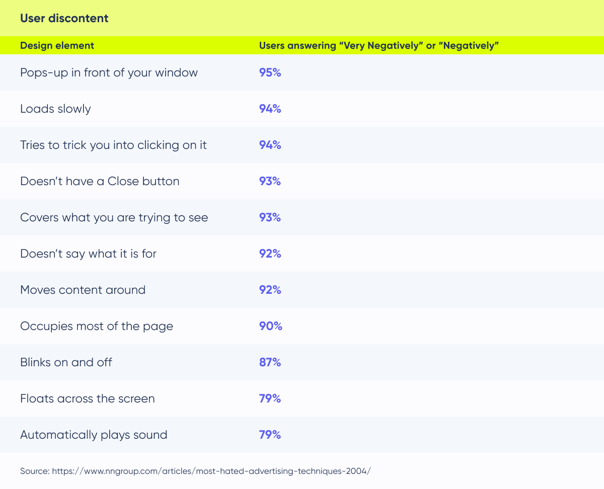
The following statistic chart is a result of the 2004 research mentioned above. It shows what happened when participants were exposed to popups while being tested, clarifying how disturbing and interrupting this type of technique can be for the user experience.

Interruption to content access due to modal overlays
If a website shows a modal over content, the user must close it to continue doing their previous task. This can lead to frustration, and the user may abandon his task or even the website with a very bad impression of the organization.
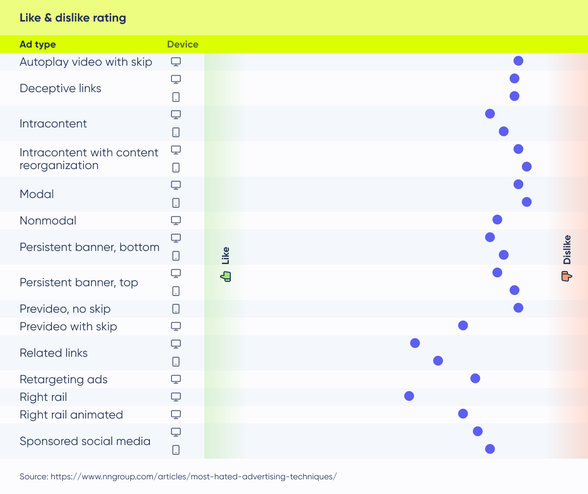
The Nielsen Norman Group study of 2017 determines which advertising techniques are most disruptive and detrimental to the modern user experience. Here are the results:

You can see the references for each type of ad in this article.
Importance of using modal overlays for delivering crucial information and only at appropriate times
Prioritizing users as the central focus of a website is crucial. In considering the utility of FOMO (Fear of Missing Out) popups, you’ll need to evaluate their potential benefits for the user experience.
We must ask ourselves: are these elements truly valuable for the user at this moment of the flow experience? Do they serve as a meaningful and beneficial addition for the users navigating the website? If yes, is it crucial to announce it through a modal? Can’t we show it in another way that disturbs the user less? As a small fixed piece of information near the main content, for example.
Overlapping popups harm site professionalism
Validated on the user tests of the researches, displaying multiple popups on top of each other makes a site look unprofessional, desperate, and disorganized. It also overwhelms users and forces them to waste time closing them. Also, there is a fact that we must consider here: people tend to close popups without reading.
Some of the main negative topics found on open questions asked to the users on the researches were:
- Animation on ads/popups
- Autoplay videos without the consent of the user
- Deceptive links (advertisements buttons or links that appear near the main CTA, confusing the user where to click)
- Retargeting (when you shop for an item online and later you see advertisements for that same item or company on other websites)
The overlapping is even worse when users are on small devices
In the context of mobile screens, popups tend to occupy a significant portion of the limited space available. While popups can be bothersome even on larger screens, their inconvenience is notably magnified when dealing with smaller ones where space constraints demand a more strategic screen utilization to ensure a seamless and enjoyable user experience.
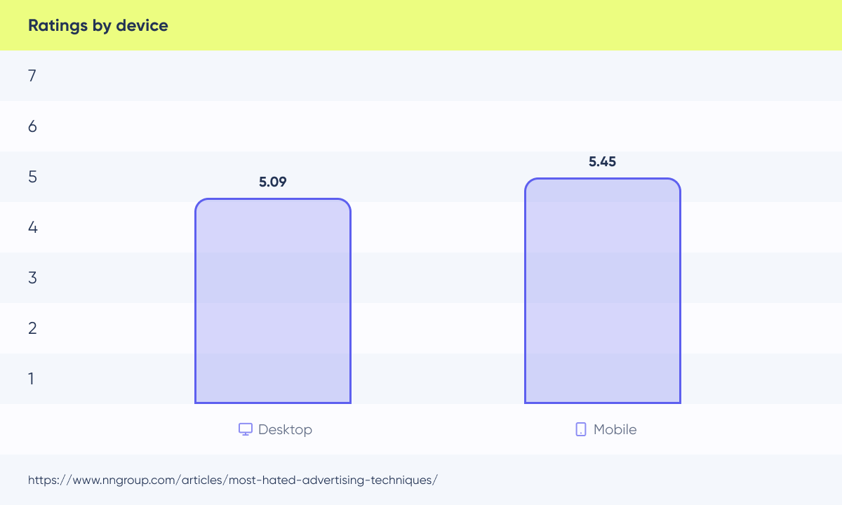
In this chart, we can see the user’s rating when asked about liking/disliking advertisements specifically on two devices: desktop and mobile.

Google penalizes sites
Google applies sanctions for websites that compromise user accessibility with these techniques, especially on mobile devices. This underscores the necessity to align with their standards to maintain visibility and ranking in search engine results.
They are firmly clear about it: ‘Pages that show intrusive information provide a poorer experience to users than other pages where content is immediately accessible.’
Here is the information provided by the company.
Banner blindness is a long-known web user behavior
This phenomenon describes people’s tendency to ignore page elements they perceive (correctly or incorrectly) as ads. It is an instance of selective attention: people direct their attention only to a subset of the stimuli in the environment — usually those related to their goals. This behavior is a consequence of our limited attention capacities. If we were to attend to the enormous inflow of sounds and patterns that surround us, we would be overwhelmed and behave inefficiently.
Conclusion
Our deep dive into the use of pop-ups within the user experience landscape has revealed a consistent truth: pop-ups are more than just a brief annoyance—they profoundly impact user satisfaction, website professionalism, and, ultimately, the success of digital platforms.
Over the years, the narrative remains the same: users dislike the disruption caused by pop-ups, especially during critical tasks. The interference with content access, the potential for overlapping chaos, and the prevalence of banner blindness are just some of the challenges posed by this UX mess.
In light of this validated information, the takeaway is clear —we need to be really careful about when to implement popups on websites. It is essential to prioritize the user and evaluate whether popups will improve their experience in each particular case or if they are hindering their ability to accomplish specific tasks without unnecessary distractions.
If you need advice on navigating the dynamic terrain of digital design, or want to create a thoughtful and user-centric approach to pop-up usage and overall UX, don't hesitate to contact our team of design experts and have a talk about how that can help!
