If you're a designer who's ever struggled to keep track of complex interfaces, then Atomic Design is something you'll want to know.
Imagine being able to break down complex interfaces into smaller, manageable parts; wouldn't you jump at the chance? Atomic Design can help you ensure consistency, efficiency, and improved collaboration with the development team when designing and deploying a product.
In this post, we'll delve into the world of Atomic Design Systems on Figma. We'll analyze different approaches, including using base components and how they can impact your workflow. Furthermore, we'll explore Figma's component properties, a powerful feature that enhances the Atomic Design experience.
To make things even more easy and exciting, we’ve prepared a Figma community file showcasing how we structure button and modal components in our design system template. Let's dive in!
Atomic design
Atomic Design is a design methodology created by Brad Frost based on the idea that complex systems can be broken down into smaller, more manageable parts.
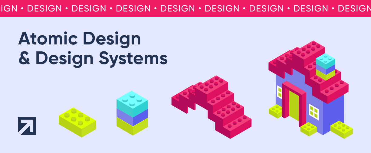
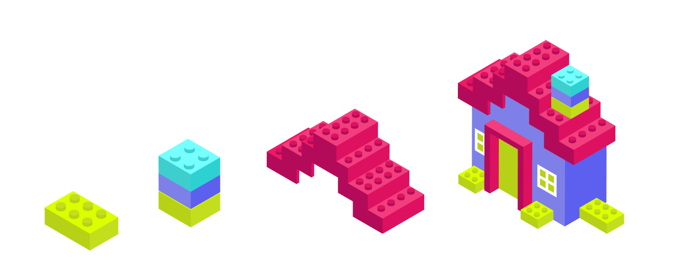
The name "Atomic Design" comes from the idea that just as atoms are the building blocks of matter, small components are the building blocks of design, and they can be combined to create something bigger and more complex, like building with LEGO blocks:
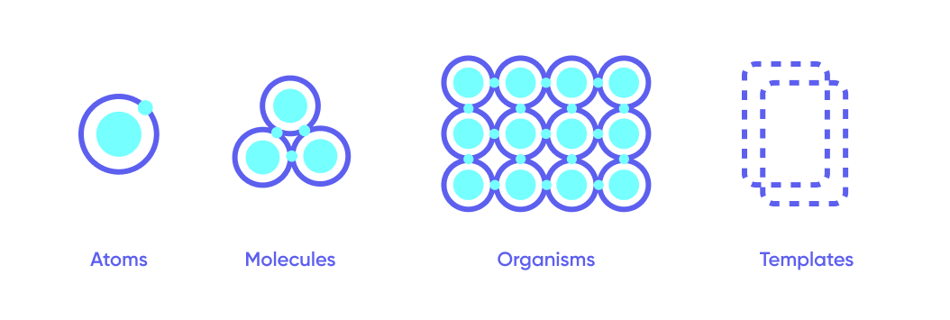
Atoms are like LEGO pieces; the basic building blocks of a digital product that include things like buttons, form labels, and icons. By themselves, they're simple, but when combined, they can create something more complex.
Molecules are groups of atoms that snap together to form a single functional unit, like a search form made up of a ‘text input’ atom, a ‘button’ atom, and a 'label’ atom.
Organisms are groups of molecules that work together to form a product section, like a header made up of a logo atom, a navigation molecule, and a search molecule.
Templates define the overall structure of a product, including things like the header, footer, and sidebar, like the instruction booklet that comes with a LEGO set.
Design systems
If you’re familiar with product design, Atomic Design might remind you of Design Systems. A Design System is a set of guidelines defining the visual style and functionality of design elements, with a focus on establishing visual foundations such as color palettes, typography, and UI patterns.
Benefits of Atomic Design
Consistency: By creating reusable components from the combination of smaller parts, designers can ensure that the design stays consistent across the entire product, even when the same elements are used in different contexts.
Efficiency: Atomic design makes the design process more methodical. With this approach, designers can focus on creating and updating individual atoms or molecules rather than trying to tackle the entire design at once.
Scalability: Making ****modifications and building new components is easier and faster with an atomic design system since the base building blocks are established from the beginning and can be reused to build more complex organisms and templates as needed.
Improved collaboration: Atomic design allows designers to communicate more effectively with developers, who can focus on building the individual atoms & molecules with the certainty that they can be reused throughout the entire product. Having set guidelines also allows for an easier feedback loop.
Challenges of Atomic Design
Time & setup: Setting up the design system is an upfront investment. It requires a bit of extra time and care to create and structure the necessary components in a way that can scale, but it will save you time in the long run. A workaround we use at Xmartlabs is having a design system template that we modify to fit different projects.
Learning curve: To create a practical atomic design system you need to understand the software you’re going to use and its current best practices, as well as the scope and strategy of the project you’re working on. For example, if you’re going to be working as part of a team, you need to make sure everyone is aligned, following the same guidelines and naming conventions, and understanding how styles and overrides work.
Flexibility: While consistency is this approach’s biggest selling point, it comes at a cost: If you adhere to a strict set of guidelines, you will run into situations where your options feel limited. In those cases, it’s up to the designer to first ensure there aren’t any modifications or alternatives left to explore and only then decide if making an exception would improve the user experience.
Software limitations: While Figma has revolutionized how user interfaces are designed, and it’s still improving and adding new features constantly, there are still limitations you need to keep in mind when structuring your design system to follow this approach. We will explore some of these issues and the different alternatives that different designers take in the next section.
How we approach Atomic Design Systems on Figma
When it comes to executing this framework, it’s easy to find conflicting opinions coming from several influential designers in the industry.
To analyze their arguments and explore the different options, we have published a Figma community file showing how we structure the button and modal components in our design system template. Feel free to duplicate it for your teams and re-use them as you wish!
The case for base components
Base components are hidden, unpublished components that are used internally within other components, also known as nesting or cascading components.
Base components allow you to reduce the number of variants needed to achieve all the combinations you need in a component set, making design systems smaller and making changes to existing components faster, since you only need to edit the base component for the change to ‘cascade’ to all variants that come from it.
Buttons are a good way to visualize the impact base components can have, since they usually involve handling a large combination of variants. Here’s the difference in Xmartlabs buttons: v1 uses base components and component properties (don’t worry, we will talk about them in the next section!), v2 only uses only component properties. Check out both versions in the Figma community file.
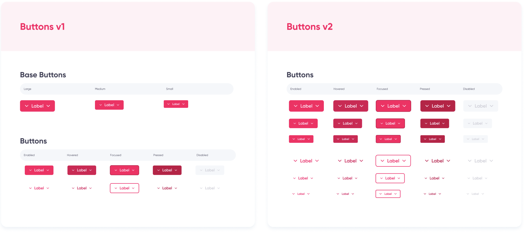
Using a base button to handle button sizes and then customizing it for the different statuses and types allows you to downsize from 30 to 13 variants.
However, base components have been criticized for some of their common issues, mostly regarding how Figma handles overrides and hidden components.
As explored by Bruno Temporim Carneiro in his medium article on cascading components:
Also, this method has its own limitations. While Figma is a powerful tool, it may not always handle different properties as expected. After the component is finalized, when you are using it and selecting which state, style, type, and so on, you want to have, going back and forth can cause the component to malfunction. I’ve realized that the order in which the changes are applied matters, so it’s important to make a coherent order with the properties. (…) Changing colors can also sometimes be problematic and may not apply correctly. For example, when you change the state, sometimes the right color isn’t applied to the icon.
Basically, his advice is to make changes starting from the base component and avoid changing properties back and forth. But granted, that can be very limiting, especially during early exploration.
In my own experience, I have found that working with nested components can cause issues when modifying color styles. Specifically, when I modify the hex code associated with a color style in a library, it does not update (or turns a different color, usually black) on the file where the library is being used, but only for the components that used nesting.
After a bit of research, I’ve found this only happens if these conditions apply:
- The design file uses an external published library.
- The base component is hidden.
- The instance has changes that override something in the base component.
If the base component is hidden, but the instance has only changes that are related to the published component (for example, changing the state instead of the size), the color will update correctly.
Once the colors are glitched, publishing the hidden base component won’t fix the issue. You’ll have to use the ‘reset all changes’ option and customize your button once again for it to update.
The way to get around this is not to hide the base component or make sure it is published if any changes need to be made. Neither of these solutions is ideal, the first one clutters the library with components that are not meant to be used, and the second one requires everyone working with the design system to be aware of the issue and remember to follow the correct steps when making modifications, with the risk of buttons in the design file needing to be manually reset if changes are made incorrectly.
Using base components used to be the standard for building atomic components, so dealing with these issues was unavoidable, but thankfully Figma has recently introduced component properties that cover some of their functionality more smoothly. And that’s why at Xmartlabs, we’ve moved on to using only component properties for our v2 buttons.
Figma’s new(ish) component properties
Last year Figma introduced component properties, aiming to reduce the amount of variants needed in component sets and making base components expendable in some cases.
Some argue that the goal of component properties is for designers to stop using nested instances altogether. But alongside this update, Figma also introduced the ‘expose nested instances’ feature, allowing you to see the properties of all nested instances when selecting the variant that contains them, making them easier to use.
Component properties also have limitations: you can’t set padding or alignment as properties, which can lead to, for example, needing more variants to cover size options.
In our experience, in cases like buttons, it’s worth sacrificing having fewer variants in exchange for a less glitchy user experience. But combining base components and properties is still useful in other cases, such as creating components for modals.
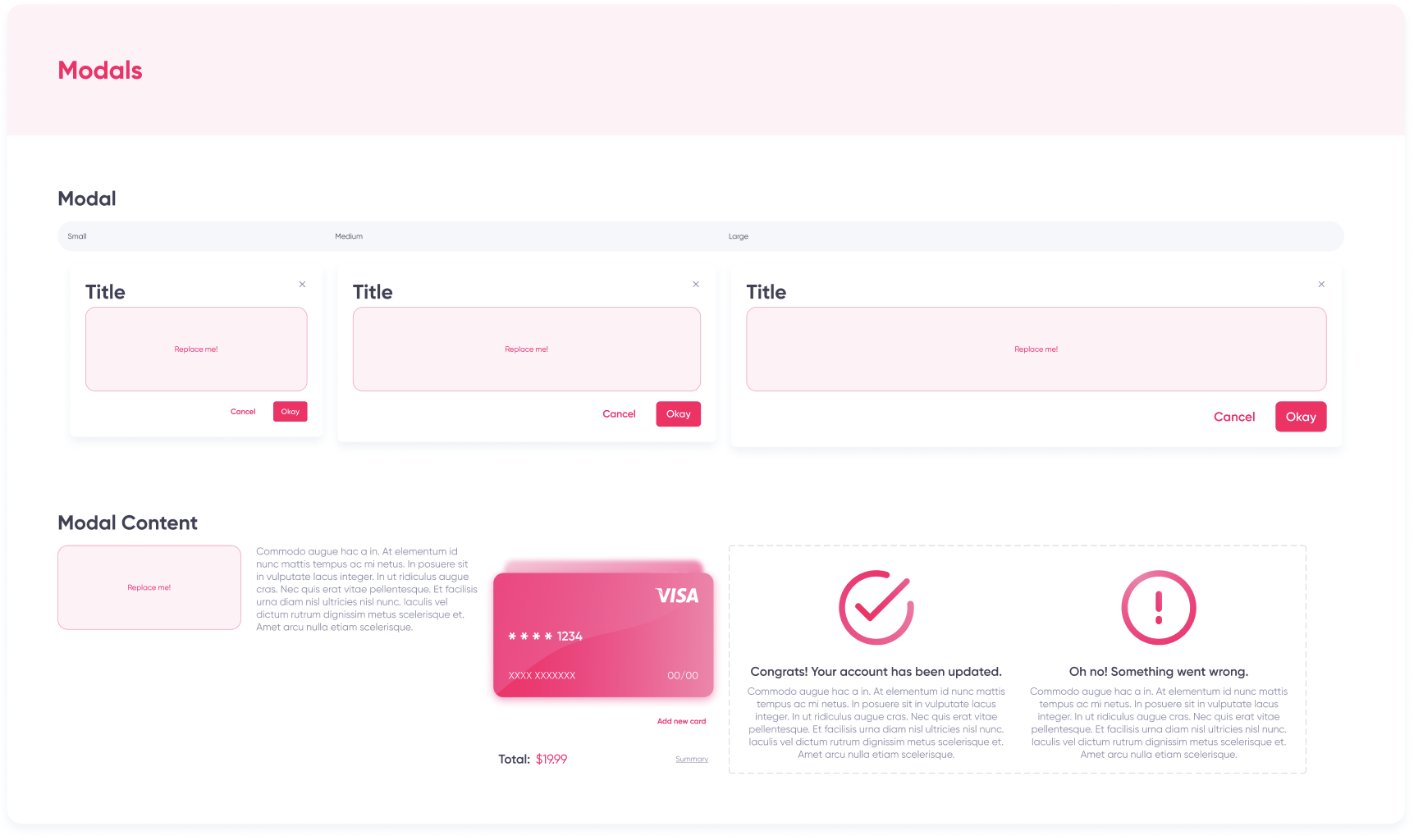
A common issue we faced when adding modals to our design system was the seemingly always growing amount of instances needed to cover all the different content that could possibly be shown in a modal and in all different screen sizes.
This led to designers creating an instance of the modal and detaching it to make modifications. While that might not seem like a problem at first, it can get complicated when the same modal is used throughout different flows of an app, and you need to do something as simple as update the copy: now what could have been a 2 minutes job has turned into 30.
A workaround for our modals problem
The way we solved this issue was by structuring our modals in the following way. Feel free to explore our Figma community file to try it out yourself and get a better understanding of how it works.
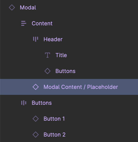
Layers.
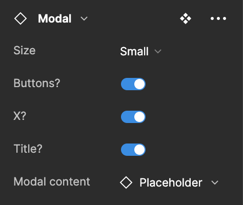
Component properties.
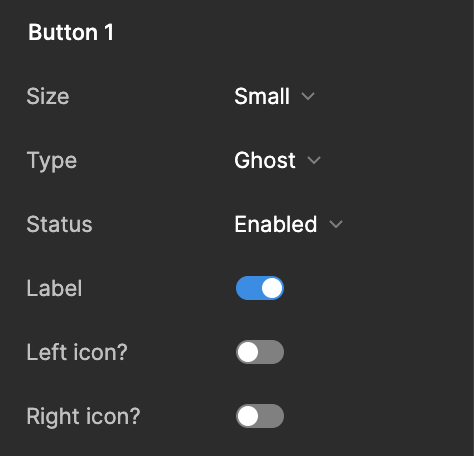
Exposed properties from nested instances
First, we create three different variants of our modal to cover 3 different sizes. Then we use component properties to handle customization of layer visibility (does this modal need buttons? or a title?), and we turn on the ‘expose properties of nested instances’ option to be able to customize the buttons when they’re visible.
Secondly, we create what we call our modal content placeholder, which is simply a base component for the content of any modal we need in our design, and we nest an instance of that new component inside our modal component. You can also go ahead and create other modal contents you already know you’re going to need, like a basic paragraph.
Now we can return to our component properties, select the nested instance and create a new component property as an ‘instance swap’.
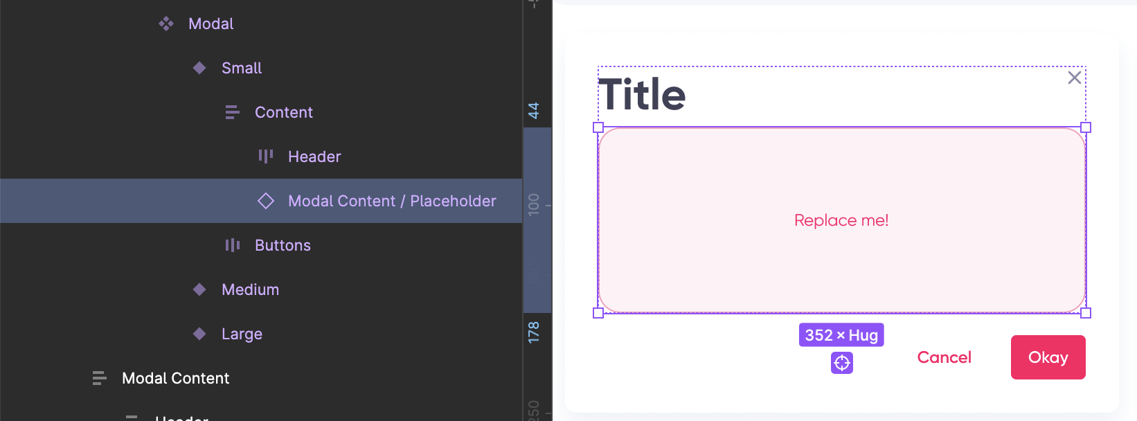
- Select the instance inside the modal component.

- Click icon to add an ‘instance swap’ property.
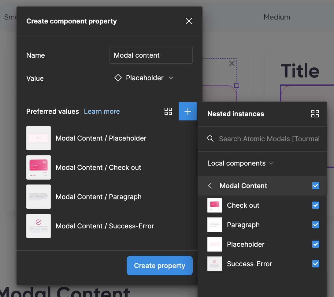
- Name and create your property.
All you need to remember when creating new content for your modals in the future is to set up your alignment and auto-layout correctly if you need the content to adjust to different modal sizes.
And that’s it! You have now successfully created a modal that can adapt to any type of content using both nested instances and component properties!
Too long, didn’t read…
Atomic Design is a methodology that breaks down complex systems into manageable components. It offers benefits such as consistency, efficiency, scalability, and improved collaboration.
It can be implemented when creating design systems in Figma. However, there are considerations you need to keep in mind:
- Using base components in Figma can reduce the number of variants needed, but it can also lead to issues with overrides and hidden components.
- Component properties in Figma provide a smoother alternative, allowing designers to control changeable aspects of a component without relying on nesting.
- Combining base components and component properties can be useful in specific cases.
Our buttons & modals community file shows two examples of how to create atomic components in Figma. You can duplicate and re-use in your own projects!
One last note
Config 2023 has brought us tons of new features, amongst them the new option to use variables to store values - such as fill color, paddings, corner radius, visibility, and more - that can be reused throughout designs.
These variables will inevitably impact and improve the way we build atomic components, probably replacing the need for styles and finally addressing the limitations of component properties, but for now, they’ve only been in open beta for a couple of weeks, and there’s not really a consensus on what’s the best way to integrate them into the design process. We can’t wait to explore them and come back with an updated version of this post!
If you have any comments or feedback or would like to learn more about our design process and capabilities, don't hesitate to reach out to our team. Thanks for reading!

