Design
Planning for the unpredictable: creating a usability test that adjusts to user behavior

When designing a website, we balance branding, messaging, and conversion goals. No matter how polished a page looks, or how thorough the information presented, if users struggle to find what they’re looking for it won’t perform as intended. This is where testing becomes essential.
By observing real users interact with a landing page, we can uncover friction points that aren’t always obvious, such as confusing content hierarchy, or missing affordances. However, what happens when the information architecture is unclear and we can’t predict where users will go?
This was the challenge we faced in a recent usability study.
The challenge: A site that outgrew itself
Our client, an early stage startup, had built their landing page alongside their first product iteration. Over time, the product evolved, and while they tried to keep the site updated, the core structure no longer supported their needs, or effectively communicated their value proposition.
With a new free trial feature introduced, we aimed to improve product adoption and conversion rates by revamping the page.
We came up with 3 hypothesis of why the landing page was failing to convert:
- Users may not know there was a free trial
- The page might fail to communicate the benefits of the product
- The account creation process might not be seamless enough.
How we approached the research
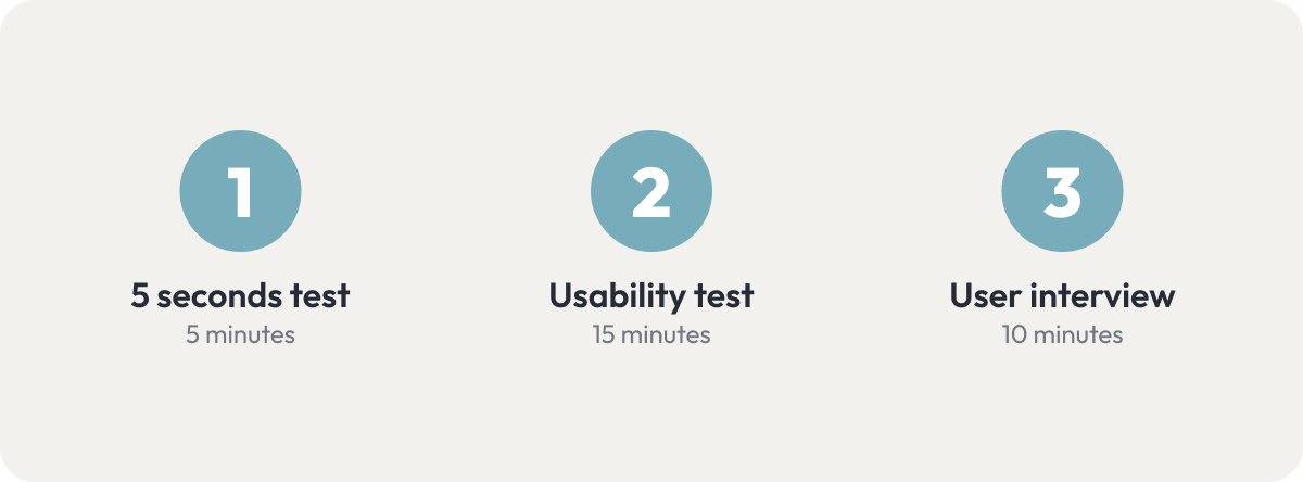
To achieve our research goals we decided to divide our study in three exercises:
- 5 seconds test: To gather first impressions, find out if the main visual anchors of the page align with the business goals, and get an idea of what users think of the look and feel.
- Usability test: The central part of the session. It will help us evaluate the overall user experience of the website by observing how users navigate the site, learn what information they engage with, and where they get stuck.
- User interview: Compare website messaging to other marketing materials, to see what’s most effective with the target audience.
Planning the test: Unpredictable navigation
During our initial assessment we realized that over time content had piled up, leading to clutter, redundancy and a confusing structure, which left users guessing where to go next.
This created a problem: Traditional usability testing requires a script with predefined user tasks and follow up questions. Scripts only work well when you can assume enough predictability to know which pages a user would visit.
We could identify at least a couple navigation paths that made sense for every prompt we wanted to give testers. For example, if we asked them how they would figure out what the product does, there were multiple reasonable paths they could take.
The home page, how it works, use cases and free trial were all reasonable approaches to learning what a product does.
If we tried to anticipate every possible move, and plan follow up questions for every scenario, it would result in the script itself becoming long and difficult to navigate while in a session. And, if we tried to refine the questions to be specific enough to not be affected by the ambiguous navigation, then we would be risking biasing user behavior with leading questions.
The solution: A flowscript, not a script
We decided to create a flowscript: a flexible decision tree that adjusts based on user actions, rather than a fixed sequence of prompts and follow up questions.
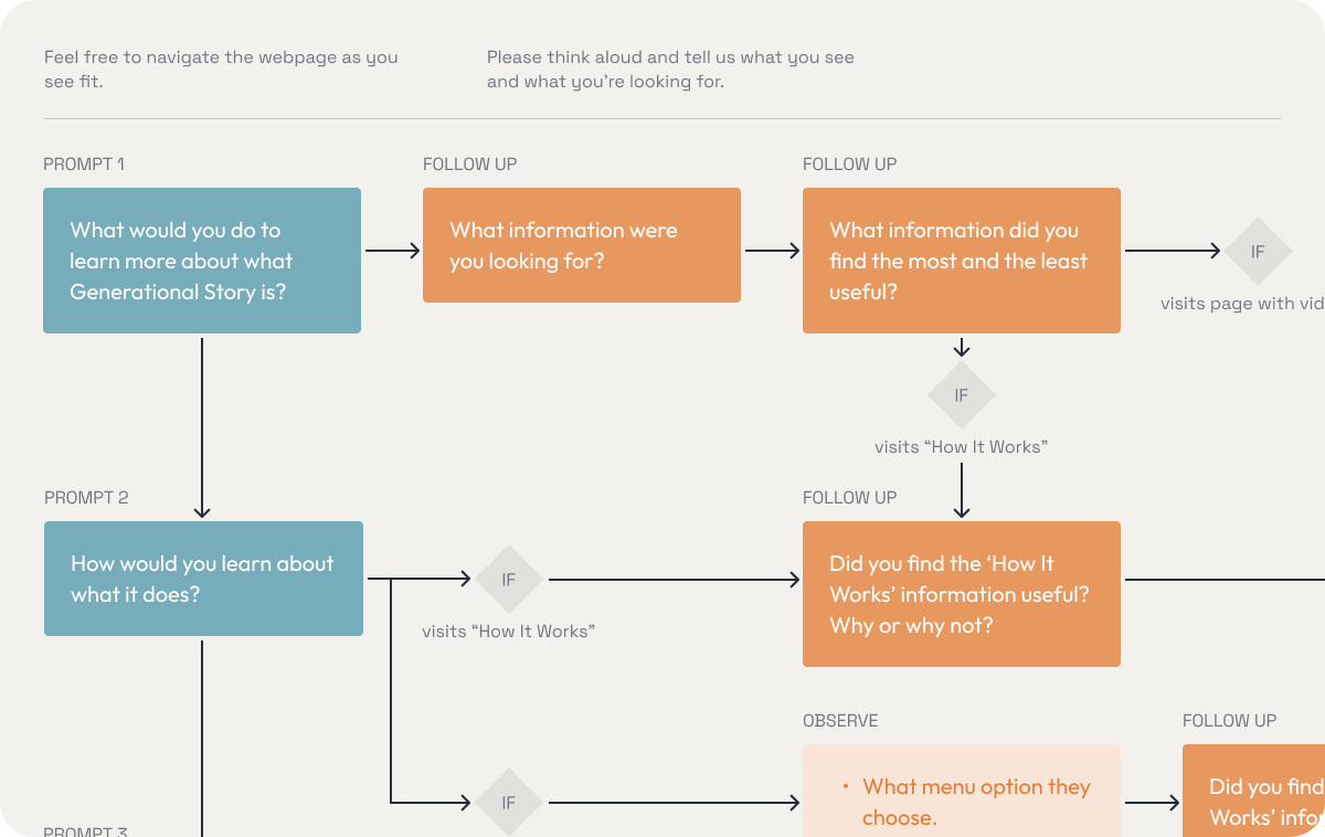
- We used broad task prompts to see how users naturally explored the site.
- Follow-up questions were triggered based on navigation paths, and whether the user struggle or succeed to complete the task.
- Optional prompts were asked depending on how testers interacted with key aspect of the website, or as a way to get them back on track without forcing them into a specific journey if they navigated too far away from our predicted paths.
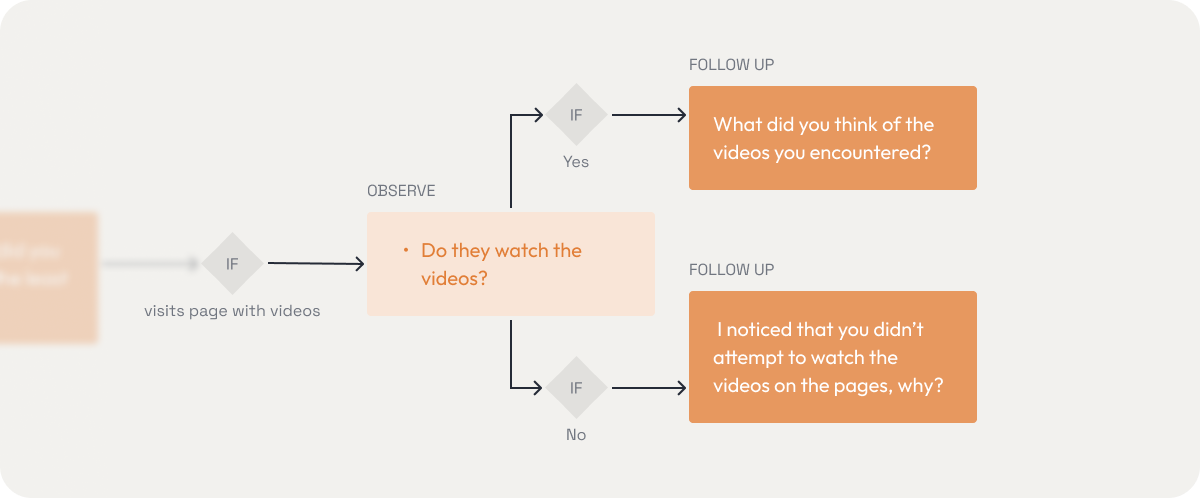
Videos were sprinkled throughout multiple pages, so we created a set of specific follow up questions.
- The branching logic was created taking into consideration confusing and ambiguous elements we expected users might interact with, or completely miss.
- If a user was stuck, we would try to get them in the right path through questions, and not guide them explicitly.
We had no way to 100% accurately predict each testing session, so we were open to making modifications to the diagram between testing sessions if we discovered new paths, always prioritizing ending up with comparable testing sessions.
Running the usability test
We conducted remote tests through Google Meet with four participants that met the demographics and interests of the target audience but were unfamiliar with the product. The sessions were led by two researchers and recorded and later transcribed and summarized to compare them.
Our 3 main prompts were the following:
- What would you do to learn more about what the product is?
- How would you learn about what it can do?
- Imagine you’re interested in getting the product, where would you go next?
Our assumption that navigation patterns were going to vary wildly was quickly proven right, as no two users followed the same path.
Some hesitated between the ‘How It Works’ and ‘Use Cases’ pages, others were overwhelmed by pricing options and scrolling erratically, and surprisingly, two users went straight to the free trial to figure out what the product was, something we hadn’t fully anticipated.
Recording of user’s screen while scanning the pricing page.
Having optional prompts and screen-specific follow up questions planned (”Do you feel like you know everything you need to know about this product to start using it?” “What else would you like to know?”) helped us accommodate for those cases and discover insights without need to improvise.
Key findings
Once concluded the study the results were analyzed and compared, and we came up with the following list of key findings to address in the redesign:
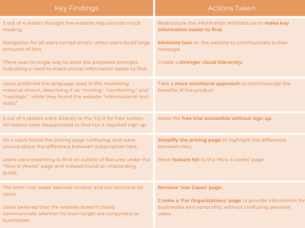
Results
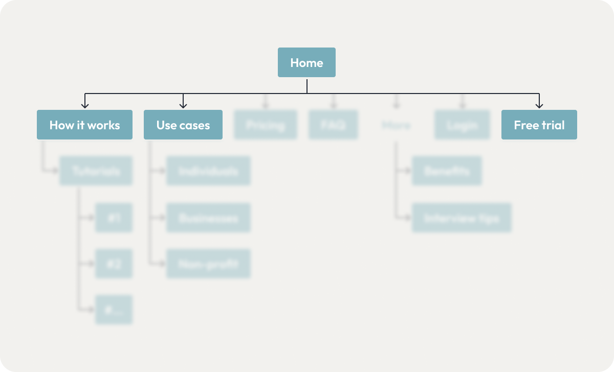
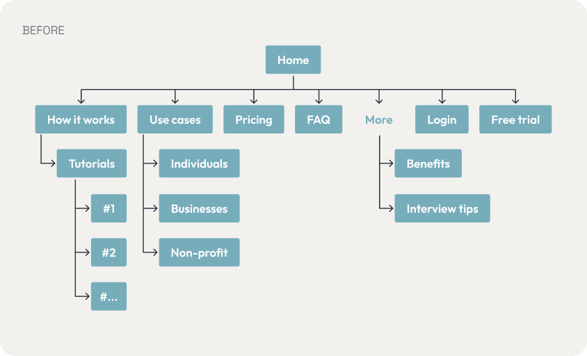
Based on those decisions the information architecture was simplified and restructured:
And the UI was redesigned, minimizing the amount of text and creating a more dynamic and stronger visual hierarchy:
Conclusion: The power of flexibility
Our flowscript approach helped us gather unbiased insights, improve navigation, and optimize conversions.
As a team, we managed to turn a challenge into the opportunity to try out alternative testing methods, learn about the perks of having flexible approaches in usability studies, and create a system that can be reused in future sessions.
For researchers tackling similar issues: don’t be afraid to think outside the box, adaptation is key when it comes to applying methodologies to real life products and users. As long as you prioritize natural user behavior, and structure your study for comparable results, your results won’t be compromised and you will be on the right path.
Have you faced similar usability testing challenges? Let’s discuss!