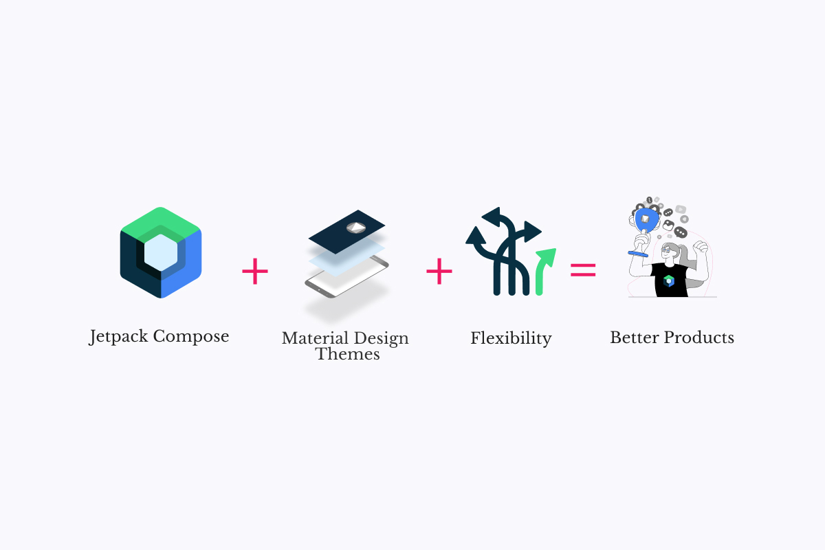
Building Android UIs with a consistent look and feel is easier than ever by using the new Jetpack Compose framework and setting up themes. Compose offers a Material theme implementation that makes it easy to use Material style throughout the whole app.
As you may already know, Material allows us to have a uniform UI that follows Android UI best practices and guidelines, but at the same time, it's super rigid and limited when the app needs a more complex UI customization level.
In this post, we'll learn how to adapt, customize and extend Compose Material Theme in order to fulfill your app UI requirements and get rid of material limitations.
What's an application theme?
Android Theme is just a collection of resources that are useful throughout a given application.
Each resource has a semantic name such as colorPrimary that can be used as a reference from different places on the app.
Most Android apps already follow Material Design Guidelines, that's the reason Jetpack Compose provides the MaterialTheme implementation, which is a systematic way to customize Material Design to better reflect your app style and branding.
Material Theme comprises color, typography, and shape attributes that can be tweaked to get custom style variations of the components.
Sounds good, but is it perfect?
Material does a great job making sure every app follows Android UI guidelines, but it clearly lacks flexibility. So, here lies the first problem: you have to adapt your look and feel to the Material guidelines, and if you don't, then it becomes hard to use it.
Secondly, Material comprises only color, typography, and shape attributes, but what if your app needs more resources, such as dimensions or icons?
Extending Material Colors
Compose provides the Colors class to model the Material color system which includes nine colors and two functions to define light and dark color sets.
According to our experience, most apps need way more than 9 colors. For example, a text link color or a subheader background color are common cases that signal the need for more colors.
An important comment here is that all of these colors should be defined in your color palette because they could change depending on the system's configuration (light or dark mode) or your app's state.
Let's suppose we want to define a subtitleTextColor, in this case, Google recommends a way to do that:
@get:Composable
val Colors.subtitleTextColor: Color
    get() = if (isLight) Red300 else Red700
If you look closely at this code, you can see that the subtitleTextColor is only based on Material color's light property.
However, what if we wanted to handle multiple color palettes in the same app, how could we possibly achieve that?
The approach we will use is to define a brand new color class named AppColor, which will keep Material standard colors and add our own custom ones.
@Stable
data class AppColors(
    val subtitleTextColor: Color,
    val materialColors: Colors,
){
 val primary: Color
  get() = materialColors.primary
  // Add other material colors properties
}
AppColors then holds all of the app's colors.
Each application can also define multiple color palettes, often selecting one or another depending on the app's state.
Suppose that we now want to define two color palettes, one based on blue colors and the other based on pink ones:
enum class AppColorPalette {
  BLUE,
  PINK,
}

// AppCustomColors is private because we shouldn't expose a color that is not in a theme
private object AppCustomColors {
  val PINK_AMARANTH = Color(0xffe91e63)
  val PINK_MAROON = Color(0xffc2185b)
  val PINK_MAUVELOUS = Color(0xfff48fb0)
}

private val darkPinkColors = AppColors(
    linkTextColor = AppCustomColors.PINK_AMARANTH,
    materialColors = darkColors(
        primary = AppCustomColors.PINK_MAUVELOUS,
        primaryVariant = AppCustomColors.PINK_MAROON,
        .... // Material Colors
    )

// Define lightPinkColors, darkBlueColors, lightBlueColors the same way

@Composable
fun appColors(colorPalette: AppColorPalette, darkTheme: Boolean): AppColors =
    when (colorPalette) {
      AppColorPalette.BLUE -> if (darkTheme) darkBlueColors else lightBlueColors
      AppColorPalette.PINK -> if (darkTheme) darkPinkColors else lightPinkColors
    }
Note that, by using this approach, we could also define a colorblind-friendly palette, improving the app's accessibility.
Given a color palette and the UI mode, the appColors method returns an AppColors instance.
The complete implementation of these classes can be found in Xmartlabs Gong template project code.
Right now we have a method that provides an AppColors palette, but then how can we get the current app color palette?
Material provides a way of obtaining the current Material color palette, by invoking a composable method named MaterialTheme.colors.
To get our custom color palette, we will use the same idea: we will invoke AppTheme.colors and get it.
For that we will have to create our app theme, a custom theme that is the result of composing the MaterialTheme:
object AppTheme {
  val colors: AppColors
    @Composable
    @ReadOnlyComposable
    get() = LocalAppColors.current
}

private val LocalAppColors = staticCompositionLocalOf {
  defaultAppColors() // For instance, pink dark colors
}

@Composable
fun AppTheme(
    darkTheme: Boolean = isSystemInDarkTheme(),
    colorPalette: AppColorPalette = AppColorPalette.PINK,
    content: @Composable () -> Unit,
) {
  val colors = appColors(colorPalette = colorPalette, darkTheme = darkTheme)
  CompositionLocalProvider(
      LocalAppColors provides colors,
  ) {
    MaterialTheme(
        colors = colors.materialColors,
        content = content,
    )
  }
}
These lines define two things, a Composable app theme to handle our custom colors and a static class that provides them. The full implementation of these classes can be found here.
Extending shape and typography
To extend these classes, we can follow the same idea.
We create an AppShapes class and an AppTypographies class the same way and declare custom theme properties.
I will not explain the code because it's almost identical, you can also find it on Gong repo and if you have any questions, don't forget to comment!
Adding custom resources to your theme
So far, we've learned how to extend the properties provided by Material, but what if our app requires new ones? Remember, a theme is a semantic resource set, so we could also need dimensions, icons, or any other resource to build the custom app UI.
Defining dimensions in our theme
Dimensions are something that we usually define in our theme since many of them have a meaning in our app context. Examples are list items' padding, a "small size", and a container margin.
We can use a similar approach here and define a dimension class:
@Immutable
data class AppDims(
    val textSizeSmall: TextUnit,
    val textSizeMedium: TextUnit,
    val textSizeRegular: TextUnit,

    val listItemVerticalPadding: Dp,
    val listItemHorizontalPadding: Dp,
)
That's all fine, but you may be asking yourself a question which is: what are the actual advantages?
First, your theme will be consistent. You can reuse the dimensions in multiple places throughout your app and thus make sure the correct values are enforced.
Second, you gain flexibility as you can define custom dimensions based on the device's state or specs. A practical example, considering devices with small screens, is to define a separate set of dimensions for them to improve the user experience.
Last but not least, you avoid magic numbers making your codebase more maintainable and readable.
@Composable
fun appDims() = if (LocalConfiguration.current.screenWidthDp < 300) {
  smallDeviceAppDims
} else {
  regularAppDims
}

private val regularAppDims = AppDims(
    textSizeSmall = 12.sp,
    textSizeMedium = 14.sp,
    textSizeRegular = 16.sp,

    listItemVerticalPadding = 27.dp,
    listItemHorizontalPadding = 30.dp,
)

private val smallDeviceAppDims = AppDims(
    textSizeSmall = 12.sp,
    textSizeMedium = 13.sp,
    textSizeRegular = 14.sp,

    listItemVerticalPadding = 15.dp,
    listItemHorizontalPadding = 14.dp,
)
Then, you have to add the AppDims to your AppTheme just like we did with the AppColors example.
Check out the complete code in Gong repo.
Conclusion
I don't have to convince you about the importance of having a good UX/UI in an app, most of the time we use top-tier apps that provide a world-class experience and we end up expecting this UI/UX quality everywhere.
Compose is coming to transform the way we build Android apps, it's a whole new approach that drastically simplifies and accelerates UI development.
Theming the application using Material Theme helps when it comes to encapsulating and reutilizing styles and assets. There is nothing worse than having a huge app that is a mess regarding the theme, assets management, and configuration.
This blog post presents concepts and ideas to leverage compose, app theming, and Material. If your app still needs more customization, you'll be able to extend Material capabilities to derive full benefit from them. The benefits are clear, we end up having a clean code base, drastically reducing redundant style configuration code, and having full control over the whole app style from a single source of truth, the application-wide theming.