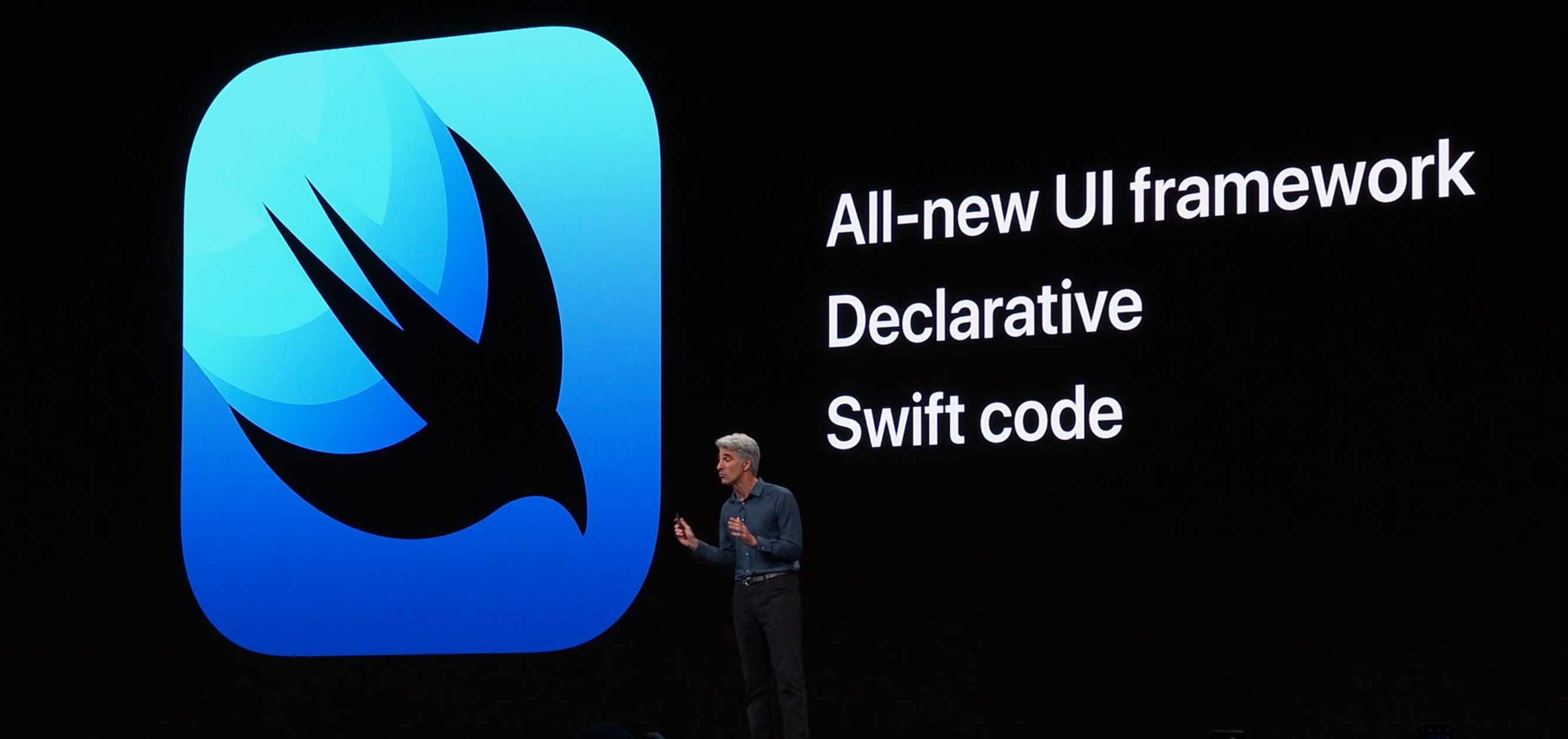
Good day everyone, so Apple just announced its new declarative UI Framework built from the ground up on Swift: SwiftUI. It’s for me the most interesting thing announced for developers at this year's WWDC. Let’s take a quick look at the basics:
The first example in the new website is:
List(landmarks) { landmark in
   HStack {
      Image(landmark.thumbnail)
      Text(landmark.name)
      Spacer()

      if landmark.isFavorite {
         Image(systemName: "star.fill")
            .foregroundColor(.yellow)
      }
   }
}
At first glance, JUST WOW, this is such a departure from the current workflow which would involve creating a TableView and the cell, setting delegates and linking outlets, configuring the cell, etc…
Lists rule mobile UI
Lists are by far the most common UI layout used today (just think about how everything scrolls down in modern apps). And given how tedious it was to create a list using UIKit it makes a lot of sense that Apple shows this as their first demo. It’s like shouting to their audience a big “Look! This doesn’t suck anymore!”. These announcements go perfectly in line with the other WWDC keynote announcements, all which respond to long-awaited needs.
New UI, familiar syntax
This is all great, but when we saw the conference we couldn't help but think of how similar this declarative syntax looks to Google’s. Flutter is looking at huge growth in the developer community , and a big part of that can probably be attributed to the UI framework being really simple to use.
How similar is SwiftUI to Flutter?
Let’s take that first example from Apple’s site again:

Swift
List(landmarks) { landmark in
   HStack {
      Image(landmark.thumbnail)
      Text(landmark.name)
      Spacer()

      if landmark.isFavorite {
         Image(systemName: "star.fill")
            .foregroundColor(.yellow)
      }
   }
}
Now in Flutter
ListView( children: landmarks.map((landmark) {
    return Row( children: <Widget>[
      Image.asset(landmark.thumbnail),
      Text(landmark.name),
      Spacer(),

      landmark.isFavorite ? Image.asset("assets/star.png"): SizedBox.shrink(),
      ]);
    }
  ).toList()),
That’s really similar! Isn’t it?
There are a few Swift vs Dart syntax differences (Swift is definitely cleaner, with the help of some nice syntax sugar), but the overall structure is almost identical.
Although a really basic example, we can pick up some differences:
-
SwiftUI Lists receive a model and automatically maps it to the cell builder function. (nice!), in Flutter we need to use a map function and then turn it into a List. (Although this would probably be done using List.builder).
-
Adding optional elements is a bit trickier in Flutter, given a Widget lists cannot contain nulls (currently in discussion).
I’m wondering how much of this is on purpose, Apple has had a few years to look at what Google and others have been doing to use as inspiration. In the end, developers don’t want to learn 5 different ways of doing things, just one that works well is enough.
The devil’s in the details
Apple’s demo images don’t really match with the example code (which makes sense for explanatory purposes). There are layout details (paddings, separators, chevrons) being left out, and one should probably wrap the cell in its own file. You can go over the SwiftUI tutorial to see the details.
Wondering how the complete screen would be done in Flutter?
Without encapsulating widgets (which is heavily encouraged) it looks something like this:
class HomeScreen extends StatelessWidget {
  final List<Landmark> landmarks;

  HomeScreen(this.landmarks, {Key key}) : super(key: key);

  @override
  Widget build(BuildContext context) {
    return CupertinoPageScaffold(
        child: CustomScrollView(
        slivers: <Widget>[
          const CupertinoSliverNavigationBar(
            largeTitle: Text("Landmarks"),
          ),
          SliverList(
            delegate: SliverChildBuilderDelegate((c, i) {
              var landmark = landmarks[i];
              return Container(
                  padding: EdgeInsets.symmetric(vertical: 5, horizontal: 20),
                  child: Row(
                    children: <Widget>[
                      landmark.thumbnailImage,
                      Text(landmark.name),
                      Spacer(),
                      () {
                        return landmark.isFavorite
                            ? Image.asset(
                                "assets/star.png",
                                width: 28,
                              )
                            : SizedBox.shrink();
                      }(),
                      Image.asset(
                        "assets/right_chevron.png",
                        width: 8,
                      ),
                    ],
                  ));
            }, childCount: landmarks.length),
          ),
        ],
      ));
  }
}
You can try it yourself in github. Have fun!
What do you guys think about SwiftUI and Flutter?
