Design
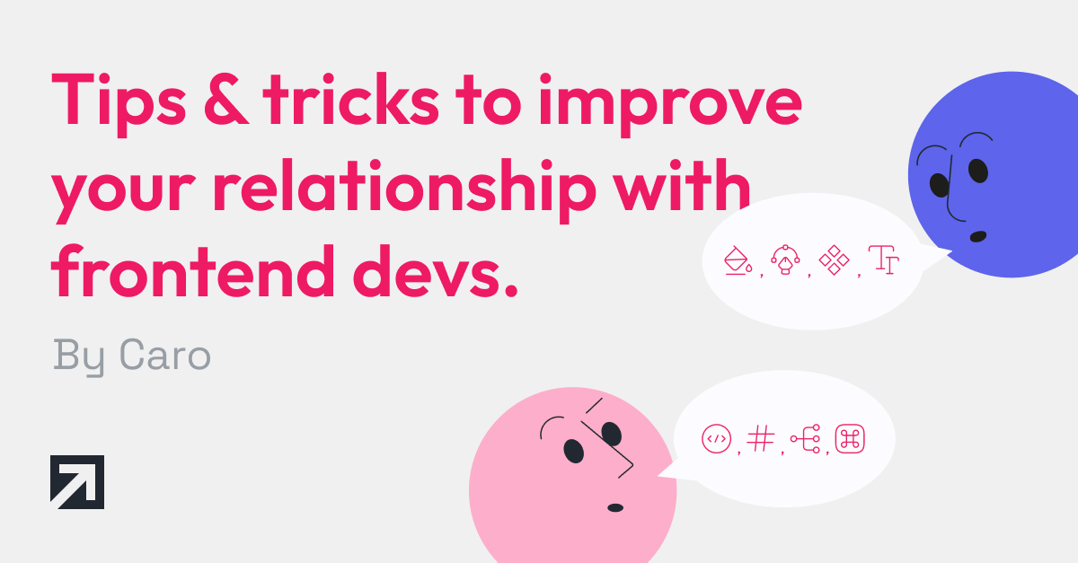
Tips & tricks to improve your relationship with frontend devs: From designer to designer

I’ve been a UX designer for over 7 years now, and during that time, I was lucky enough to work daily with frontend professionals on most projects. This has provided me with tons of experience and insights into the sometimes complex dynamic of these two professions working together. So, in the spirit of sharing, I will expand on tips and tricks for designers I've gained throughout the years when it comes to the relationship between the design and frontend team.
Although this is not written in stone (it's based on my own personal experience, after all), I do hope it can lead to conclusions that may be useful for other designers in similar situations.
Use safe area for icons
Imagine a list of tiles where every row has an icon to the left. If those icons are all different in sizes and proportions, it will be difficult for you as a designer to fit them as you wish in the tile, doing the manual work of aligning and resizing them to try to visually look all the same size. In contrast, if they have the same proportion, the work is easier as you won’t have to modify them one by one and the distances to the labels are going to be always the same.
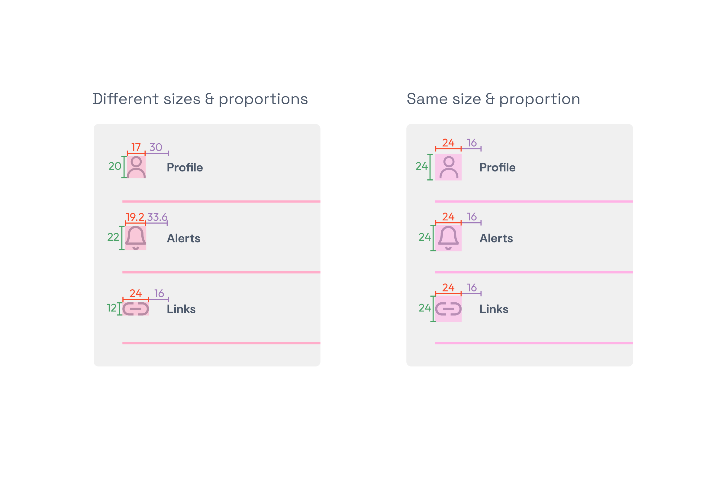
Consider the same scenario but for engineers. They will have to look at every single size for each of the icons and each distance to the label to recreate the design perfectly. Of course that won’t happen because they simply can’t go through every detail, and you will likely end up frustrated when you see an icon much smaller/larger than the others.
It is the designer's responsibility to deliver all the icons in the same proportion (a square). This will make our own work easier and, in consequence, easier for the engineers that will use them in a more simpler way.
Important side note: consider this tip also for a list of logos. Deliver them to the engineers all of them in the same size and format.
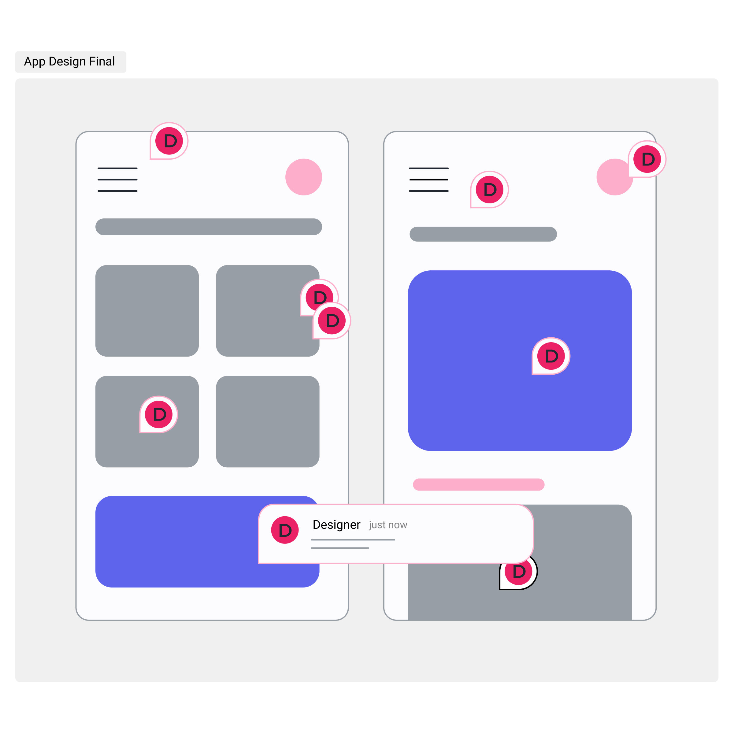
Speak the same language
Unfortunately, there is no unique terminology for every component and interaction in digital products. Every designer and engineer calls each element differently -not to mention that all coding languages are different too, so in each project the terminology may change. This is a problem that leads to misunderstandings where we end up not knowing if we are talking about the same element or not. Here is when the question always comes: “wait a minute, by [term], are you referring to…?”.
As a tip, what I always do is to try to remember their terminology and switch to that when necessary if the conversation is getting nowhere. In the cases that I don’t have any previous terminology for that specific topic, I always embrace the term they use to unify speaking.
One option that is also really useful is to have a glossary document shared throughout the company where everyone speaks the same language. Xmartlabs is currently working on it, so it will come soon!
Decide on names, before they do it for you
Naming layers is tedious and manual work, I know it and I see you. Developers will need names to organize the code's content so they will come up with all of those descriptive titles even if you don’t.
However, if you give them that information, they will take it as a fact (no one wants to rethink any name) and, as we saw in the section above, this effort will benefit the communication between both teams. Plus, the terms will be defined only by you, so you will follow rules you think are best. Own it.
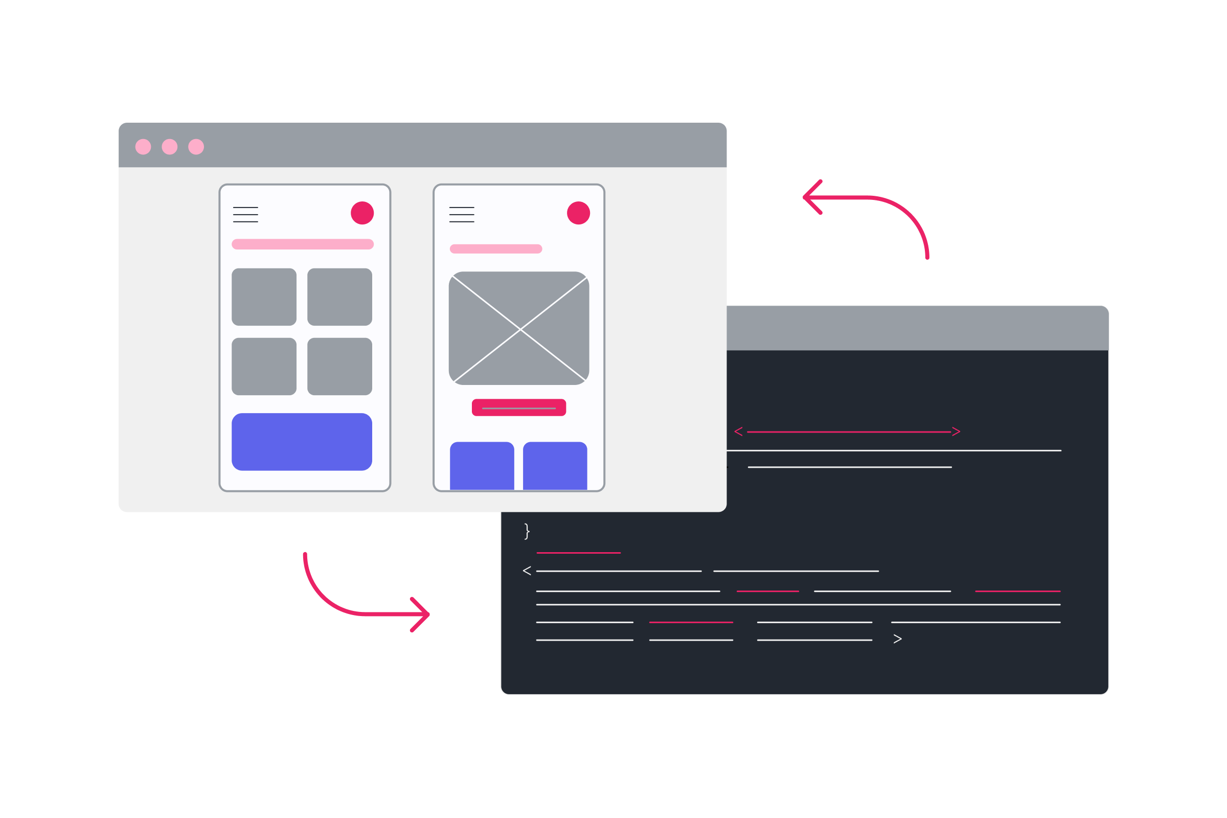
Think inside the box
The platforms dedicated to creating digital design projects are basically based on a blank canvas. You can put in there every idea you have and the tool will allow it. However, on the development side it doesn’t work quite like that and the space is more like columns and rows, grids, and boxes of content.
It's true that there are landing pages with an incredible design that include lots of elements floating around and fabulous interactions and details that contrarrest my previous paragraph. But for that I’m certain you will need a lot of more time from you and the front end team, as those pages are much more complex to implement. Going through these approaches is a matter of costs and team capacity/availability; that’s why it's more common to see pages more structured and simpler in composition.
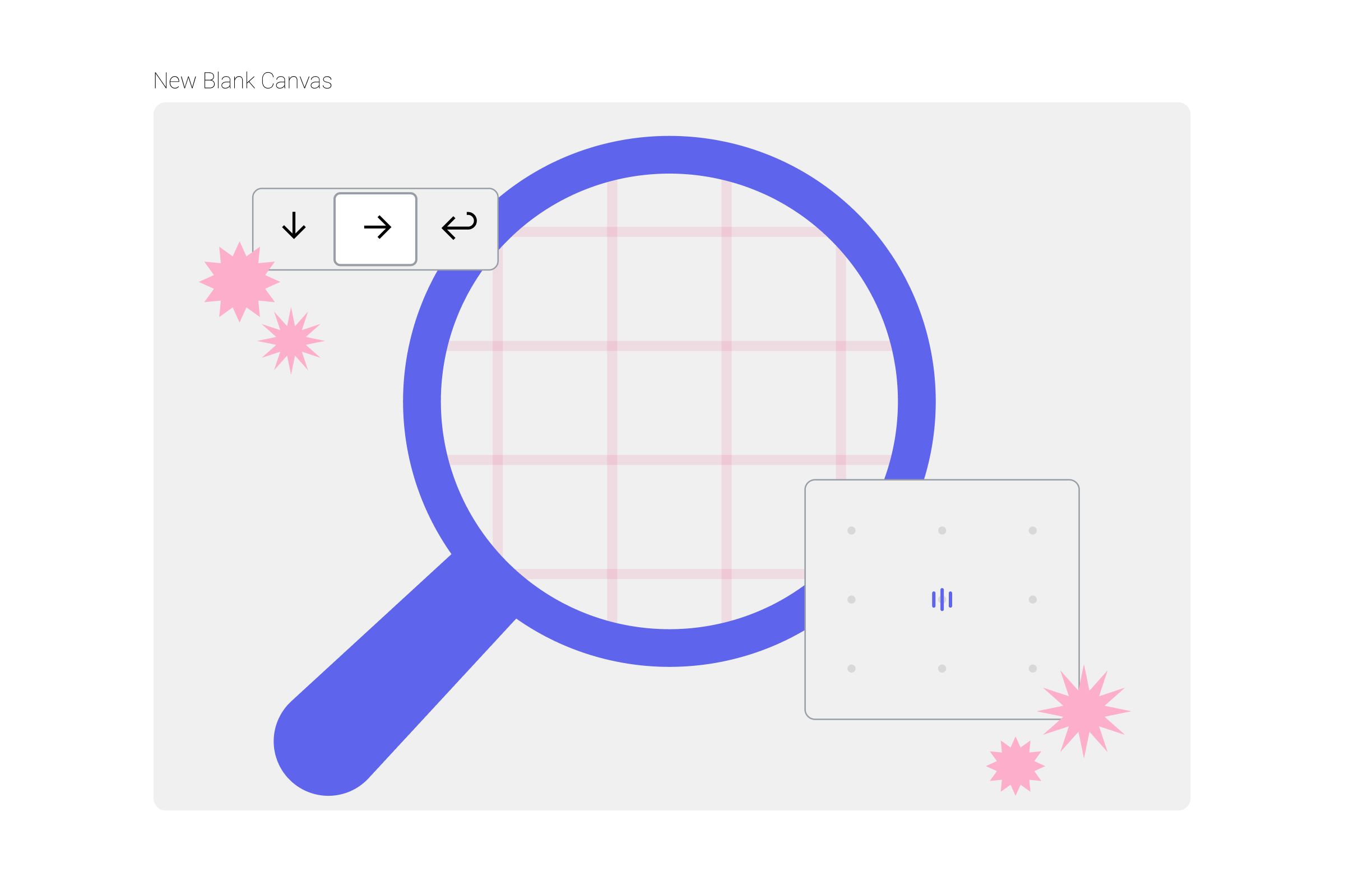
There are some specific tools in the design platforms such as the autolayout in Figma, that help structure the components and limit the composition a bit to be more aligned with the implementation side. So although the freedom provided by design tools and your wish to challenge your skills will make you wanna give free reign to your creativity, it is important to try to adapt your designs by being mindful of implementation constraints.
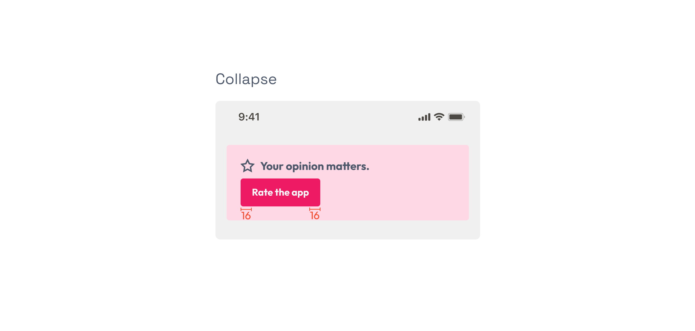
Your designs are valid just the way they are: don't give into the pressure to fit them in
Imagine you are designing a screen where you want a button to fit in a specific space but that can't happen because said space has fewer pixels in width than the button. So you edit that button and change its horizontal padding from 16 to 8 px to fit.
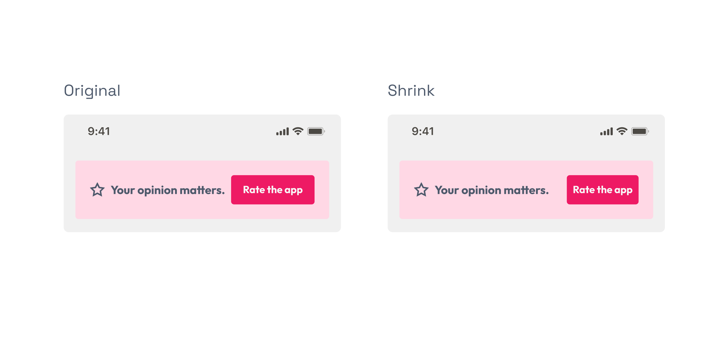
The engineer won’t be revising every small detail in every reused component. We need to be realistic, that scenario will not be implemented as seen in the image so the button will collapse and this will end up looking very different than what you had planned.
Sure there can be exceptions and you can talk to the engineer and arrange the change in that specific button. But, was it an exception for the good of the user? Or was it just to fit the design? What will you do in smaller screens where the problem will be the same? From my point of view, it's better to work with the original button of the design system and accept that, although the design may not look perfect, it will be realistic on what will happen then on the implementation.
The happy path is just the beginning
As a designer, you must try to anticipate every possible scenario the user may be facing. You should work on this as much as you can before the development process. If not, the cases will emerge during the development stage, requiring collaborative problem-solving with the engineers.
This work involves lots of lateral thinking so don’t be disappointed if some cases aren't initially covered. The more you can cover, the easier it is for you and the devs to avoid returning to past flows to modify things because the screens hadn’t covered the edge case the developer has just taken notice of.
To achieve this, always mind these scenarios:
- Empty states: situations where there is no content to show. A good way to imagine these cases is from the point of view of a user the first time they reach a screen or page, or thinking of the app as it is launched for the first time and doesn’t have any content yet.
- Interruption Testing: what happens in unexpected situations that can interfere with the user flow like no internet connection, closing the app in the middle of a task, running out of battery or phone blocked.
- User extremes: think about what happens when the user has lots of information or activity or cases with articles with really long titles.
- Error states: missing documentation, form errors, trying to close a flow without saving, databases crash or time out cases.
- Flow secondary interactions: as a final check, go through every screen or page and look at each component that is clickable (buttons, bottom nav, links, checkbox) to try to find if there is any interaction left to design.
Be mindful of the environment (your time): Reduce, reuse and recycle (your designs)
Let’s imagine you need to design a new screen for a mobile project you have been working on for some months now. Part of its content was already shown on another screen you’d designed before.
If you’ve already designed how to show that content in another page, why don’t you consider reusing it exactly the same as on the previous design? I mean literally copy-paste. By doing this, you reduce the hours the developer will spend on implementing it, but also:
- the hours you will spend designing (so you can focus on another important and new task)
- the hours for you to review the new release as you’ve already validated the implementation before in that other page
- also, while users may not realize it, you'll minimize the time they take to understand that new information since they'll only need to learn how to use or read that section only once.
Anyway, it is important to analyze each specific case because we want to simplify things and save time but we don’t want to cause any problems. Sometimes it will be better to create a new entire section or copy only the elements that are exactly the same. This might be necessary if for example the purpose of the content is different (informational vs marketing), or if the content is not exactly the same (one needs filters or different type of cards), or if duplicating the design creates a monotonous/boring composition (because the user sees it too much).
Over-explain: better safe than sorry
If at any moment, in any design, you’ve got a really small -no matter how small- doubt that the developer may not understand something, clarify it. Trust yourself, the developer will come to you later to ask it if you didn’t write it down when you had to.
And that in the best of cases: on the other side, the developer will end up deciding something that is not correct and finally complicate the flow for the user.
Always synchronize the designs with the implementation
If the implementation doesn’t follow the design, you open a ticket and they must adjust the code. The inverse of this holds as well, but sometimes we don't give it the importance it deserves.
Imagine you are discussing something complex with the developer -like a change in the way a filter acts- and you both agree that it has to be changed. As the release is already implemented, the change is made directly on the code and not updated in the designs. If you need to iterate that flow in the future, you will be modifying a design document that is not the real situation of the user nor the code that is already implemented, so you will lose time and the developer won’t understand what to do. Always update the designs and you won’t have this issue.
When in doubt, a developer you should seek out
If you are doubting if a design can be complex to implement, there are two possibilities: either it is simple and you will be happy with a fast implementation, or it is really so complicated that the developer needs you to redesign parts of it because of technical constraints you could have anticipated. Save yourself time, ask the engineer first.
It takes time and experience to try to think if something may be difficult to implement and, even if you are used to identifying it, you won’t be able to point out all the scenarios every time. To start thinking about it, it can be useful to read the “Think inside the box” section above and also you can count on the advice of the next section.
Take advantage of templates
The developers count on predefined libraries created using the coding language they use for each project. From there, they can get simple components such as buttons or text fields to use as a basis, not create that element from scratch, and save a lot of time.
Sometimes, they can take advantage of more complex components. Let’s imagine, for example, a crop image tool for an app. That may take a lot of hours of implementation, so I usually ask the frontend team if there is a component already created that we can use as a basis to cover that case. If the answer is yes and that predefined UX is beneficial from a design perspective, I start designing from there. In the future, this will help the dev team code a lot.
Final thoughts
It is really common to hear designers say their designs weren’t implemented correctly and that their original files were more accurate and well-organized for users. This is why the relationship between designers and frontenders matters. If you can work more closely with them, anticipating problems before they happen, clarifying doubts and enhancing the communication, then you will spend less time revising the releases and have more time to focus on product iterations and new features for the users.
In addition, we need to think of this process as a relationship in continuous learning. As technology and tools evolve, we should also iterate the methods and strategies for collaboration to create a more cohesive, efficient team.
All of these recommendations may seem overwhelming at first, but it is a matter of time to get used to it. I can assure you that in the future you’ll automatically do most of them without even thinking.
If we've missed something in the post, or you'd like to discuss design further, don't hesitate to reach out or learn more about Xmartlabs' work! 😀